
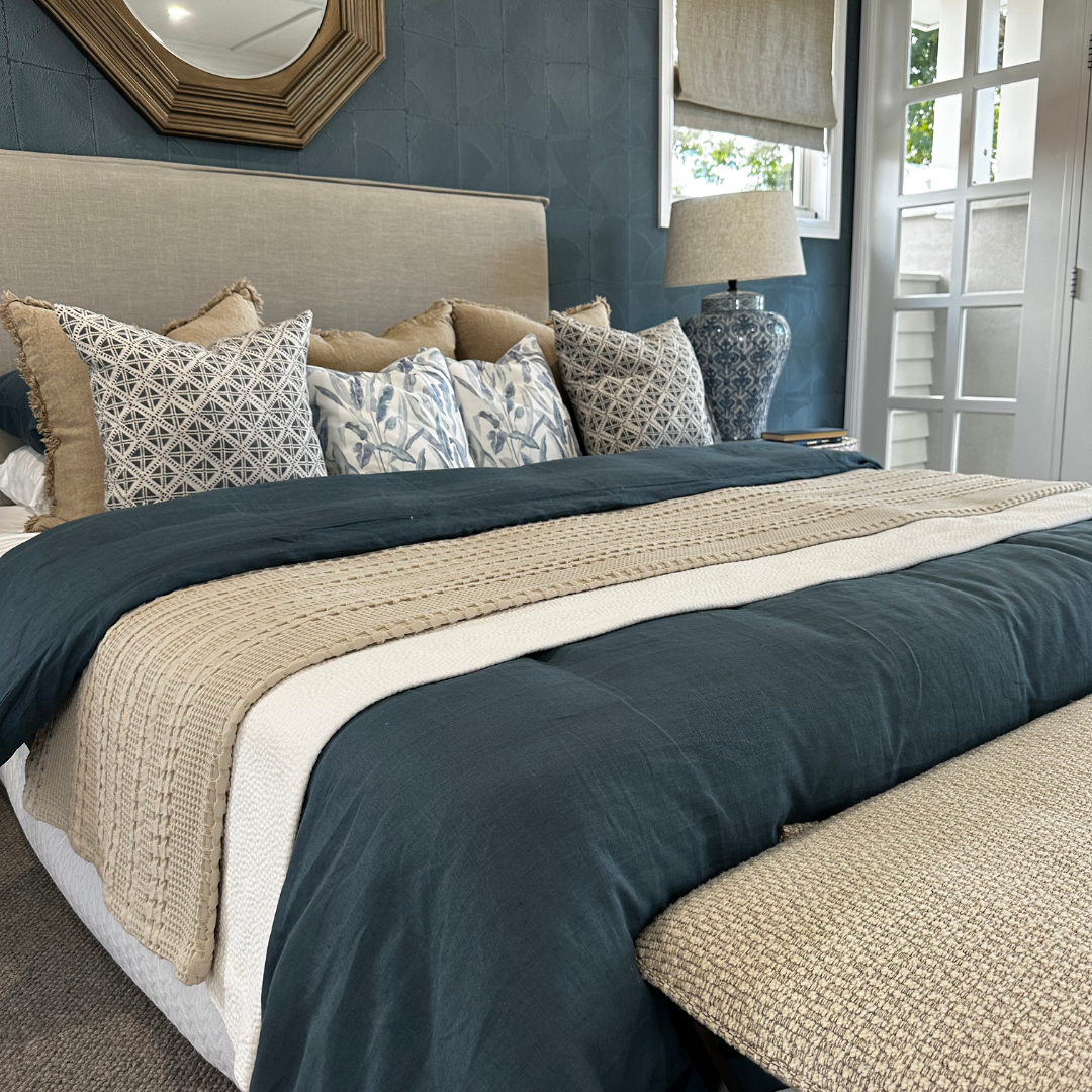
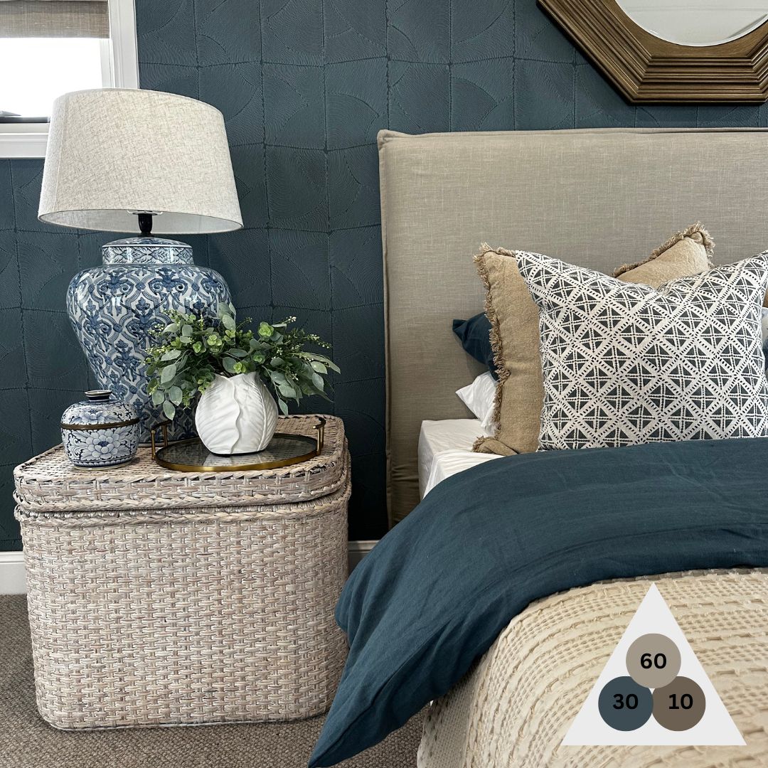
The 60-30-10 rule ultimately provides a simple guideline for developing accented colour palettes in interior design. It divides the colours of a space into three sections: 60% of the scheme should be the dominant colour, 30% the secondary colour, and 10% the accent colour.
Using this rule can create visually-balanced interior spaces particularly when decorating with lots of furniture as it will help colours complement each other.
60% of the colour scheme is the predominant colour in the room. Usually, this will be a neutral or muted colours that can take up a lot of space without feeling overwhelmed. The idea is for this colour to anchor the space and create a backdrop to the room. This main colour should be used for walls, rugs and larger elements when considering the mood and feel of the room.
The secondary colour in the room is the next 30% and acts as a bit of a border. Its purpose is to provide contrast; it’s different enough to visually support the primary colour but not steal the show. This colour could be side chairs, textiles, area rugs, curtains or other distinctive elements in the room.
The remaining 10%, is the accent colour, or the splash. The accent colour can be used on throws, cushions, decorative accents and lamps.
Now, rules are made to be broken right?! If you don't like the results, breaking the rules may work best for you. If a 30-30-20-20 formula feels right to you, then experiment with that; just pay attention to harmonising the colours. When you find your balance, it will speak to you.